Mobile Search Updates: Why You Need a Mobile Website
Why Do You Need a Mobile Website?
With technology constantly growing and advancing, the average website now receives approximately 60% of its traffic from a mobile device.[1] Google reports that 94% of people with smartphones search for local information on their phones and 77% of mobile searches occur at home or work, places where desktop computers are most likely to be present. In 2014, the number of mobile users surpassed the number of those using a desktop. These statistics confirm the growing popularity and need for a company’s mobile presence online, including the need for a well-constructed mobile website.

Updates to Mobile Search
In April 2015, Google will introduce mobile-friendliness as part of their search algorithm. This update will put emphasis on sites designed for mobile search and give priority to these pages in search results.
Google has also made a number of display updates for mobile search results, including separating results with a colored line
and app indexing, where users will be served a link to a previously downloaded app if appropriate. Google now labels mobile friendly websites directly within search results. Having this label may help increase click through rates, as users know a mobile friendly website is more likely to load quicker and will be easier to navigate on their device. You may also see the word “slow” next to websites with long page load times.
Google also has available a Mobile Usability report within Webmaster Tools and a PageSpeed Insights tool for mobile sites. This is a great start for understanding where your website currently stands in terms of mobile usability.
What is a Mobile Website?
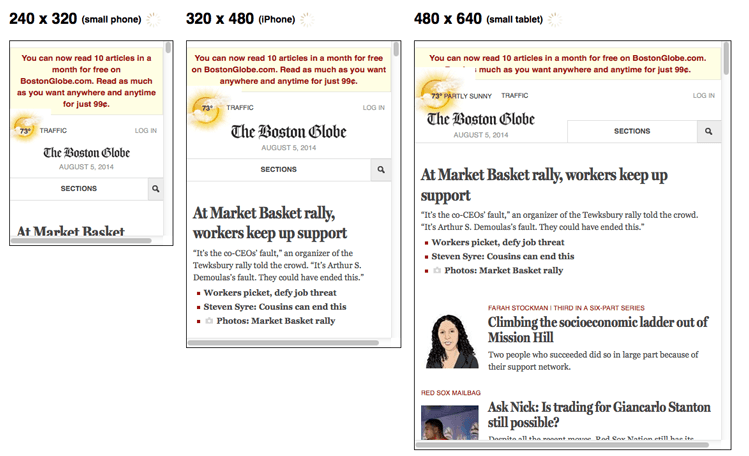
The most common type of mobile website uses a “responsive design.” A responsive design website is a single website coded to “respond” to the device of a user. With this design, the website can adapt by changing the width of columns, text size, button spacing, etc. to offer optimal mobile viewing for the user.

Another type of mobile website is the “M.” site (m.site.com), which creates a separate mobile website. These sites are becoming less popular as they often provide a poor user experience and require much more coding to maintain. Mobile-only pages also need to build up their own reputation (content, links, etc.) because they do not receive shared indexing signals from an existing desktop version of the page.
[1] http://smallbiztrends.com/2014/07/online-traffic-report-mobile.html
