What is Google Data Studio?
Google Data Studio is one of the newest additions to the Google Analytics 360 Suite. This interactive data visualization tool was moved out of BETA stage in late Spring of 2017 and continues to evolve weekly. The easy to use tool allows marketing professionals to pull information from multiple data repositories into one centralized, live, visually appealing, interactive dashboard. Google Data Studio dashboards allow its original owner to share important data sets while maintaining control of what information can be accessed. The Data Studio dashboards are perfect for internal use but are equally as valuable for client reporting. Typical to most Google products, the dashboards are saved automatically online within your Data Studio account and can be edited by multiple users at the same time. In a nutshell: Google Data Studio allows all businesses (large or small) to visualize data in a simplistic and efficient manner!

Why Should You Use Google Data Studio?
Google Data Studio is an incredibly powerful visualization tool. The ability to bring in data from multiple sources on one page at the same time gives you the flexibility and ease to consolidate reporting platforms. Are you interested in seeing how your Paid Search efforts have changed Month-over-Month, but also want to see Year-over-Year results at the same time? Not a problem! Or are you trying to determine which channel converts best on a mobile device? After implementing a few filters within your report, this information is only one click away! There are countless reasons why we believe marketing professionals everywhere should be taking advantage of Google’s new reporting tool. Below are the top 5 reasons why we have adopted Google Data Studio as our primary reporting tool here at Charles River Interactive.
1. It’s FREE!
Google Data Studio is free of charge. All you need to do is create a Google account. While in the BETA stage, Data Studio only allowed a maximum of 5 reports, limiting its abilities to be used by marketing agencies and small businesses alike. Google has since removed this limitation and you are now able to create as many reports as you need. Comparable products such as Tableau, Qlikview, FusionCharts, Plotly, and many more can cost over thousands of dollars a month.
2. Endless Customization Options
Let’s be honest, reporting can sometimes be tedious… but not anymore! Google Data Studio provides you with the ability to change colors, fonts, background images, and essentially everything you need to make your reporting look top notch. Here at Charles River Interactive, we understand everyone prefers to look at data differently. Google understand this as well and thus has provided multiple options on how you are able to present your data. Pie charts, pivot tables, line graphs, bar graphs, tables, geo maps, scatter charts, area charts, bullet charts…. Google Data Studio has you covered.
3. Calculated Fields
Are you looking to transform, categorize, and make calculations within your data? Are the default dimensions and metrics from your data repository just not enough? Calculated fields give you the ability to create new dimensions and metrics in your data source that perform arithmetic, apply mathematical formulae, extract or transform text, or return new information based on logical comparisons. Once the calculated field has been established, you are able to use the new dimensions and metrics in charts and filters, just like the default fields. This means grouping pages, creating ratio formulas and custom naming conventions can now all be done within the visualization tool itself.
4. Community Connectors
Out of the box, Google Data Studio natively connects to other Google products such as Analytics, AdWords and Sheets. However, at Charles River Interactive we understand that many businesses operate and report on multiple different data sources outside of the Google family. This is where the power of Data Studio Community Connectors comes in! The best way to think of a Community Connector is to visualize it as a pipeline between Data Studio and your favorite web service, where your data is stored. As mentioned before, Google continues to make small upgrades to the Data Studio platform and one of those upgrades includes an option for third-party connectors such as Supermetrics. These third-party connectors allow you to easily bring in data from sources such as Bing Ads, DoubleClick, Facebook Ads, LinkedIn Ads, Twitter Ads, and Yahoo Gemini to name a few. Once the third-party connection is setup, the process for creating reports is the same as when you are using a Google data source.
5. Sharing Capabilities
Google Data Studio is built to efficiently optimize collaboration capabilities. Much like a Google Doc or Sheet, Data Studio allows you to seamlessly share your report with others by simply sending them a URL link. Data Studio also provides you with the ability to control how each user can interact with the dashboard by assigning “view” and “edit” limitations. These sharing options give you (the report owner) total control and allow you to easily collaborate with clients and teammates without having to exchange password information that could in turn provide access to your Google Analytics account.
Getting Started
So now that you better understand some of the capabilities and power of Google Data Studio, you are probably wondering how do I get started? Luckily, we have put together easy to follow instructions on just how do that.
1. Establish a Google Data Studio account. Most people choose to use the same account as their Analytics & Search Console setups. We recommend this method (utilizing the same account login email as the one you have for Analytics & Search Console) as this will make the sign-up process quicker and easier.
2. Complete the tutorial. Google offers an extremely helpful tutorial to get you up and running. It only takes about 30 minutes to go through the tutorial and by the end, you will know enough to create your own very first dashboard.
3. Explore the Data Studio Report Gallery. This report gallery is a collection of both Google product templates and user submitted dashboards that are available to you, free of charge! We have found these templates to be tremendously useful and instructive when trying to display data effectively.
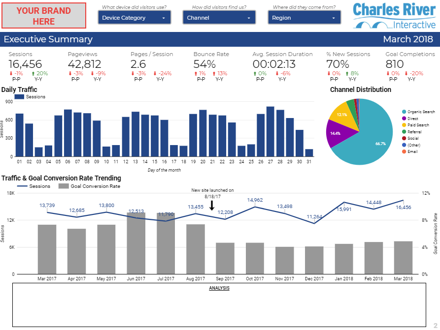 An example of a Charles River Interactive analytics dashboard
Final Thoughts
In the competitive business landscape we operate in today, being able to make data driven decisions is more important than ever. Google Data Studio provides organizations of all sizes the ability to easily visualize their data in ways that will foster new insights and recommendations. Here at Charles River Interactive we use this tool on a daily basis, we set up reports for our various clients, and we believe that other businesses would benefit immensely from using it as well. So, what are you waiting for? Stop laboring over messy excel spreadsheets and manual diagrams and start creating professional looking reports by leveraging the power of Google Data Studio!
We hope you enjoyed learning more about Google Data Studio and some of its incredible capabilities. At Charles River Interactive, we believe Google Data Studio is revolutionizing the data visualization game. Still have questions? Or want to share what you love most about Google Data Studio? Reach out to our Integrated Web Services team at info@charlesriverinteractive.com.