by Charles River Interactive | May 18, 2016 | Industry Trends, Organic Search, Uncategorized
A recent study by Opinion Lab, highlights the following impact of consumers using their mobile devices to search for businesses and make purchases:
- Mobile impacted $1 trillion in retail sales in 2015.
- In the US, more than 30% of sales will have a mobile cross-channel component.
- 50% of consumers who conduct a local search on their smartphone visit a brick-and-mortar location within a day
- 82% of shoppers say they consult their phones on purchases they’re about to make when in a brick-and-mortar location
Google’s response
In the quest to make the web more mobile-friendly, Google rolled out their second algorithm update on May 2, 2016. This update is designed to benefit mobile-friendly websites in Google search results. The results increase the effect of the ranking signal to help users find even more pages that are relevant and mobile-friendly.
According to Google, a website is mobile-friendly if it meets the following conditions:
- Does not use software that is unusual for smartphones, such as Flash.
- Text is readable without zooming.
- Content fits on the screen completely, without the need for the visitor to scroll horizontally.
- Buttons and links are far enough apart, so that a finger can easily click the correct one.
Testing a Website for Mobile Friendliness
If you are unsure if your website is mobile-friendly or not, then you should use an official Mobile-Friendly testing tool such as the following:
The testing tools also have suggestions for next steps based on the results of the mobile friendliness test.
Questions Regarding Google’s “Mobile Friendly” Algorithm Changes
If you are like every other business owner or website administrator, then you have questions. On April 21, 2016, previous to Google’s 2nd algorithm rollout, Google published a post, FAQs about April 21st mobile friendly update. This article answers the top 13 questions site administrators, SEO’s and business owners have about the latest mobile-friendly algorithm update.
We selected a few of the questions and answers from the April 21st post:
Will desktop and/or tablet ranking also be affected by this change? No, this update has no effect on searches from tablets or desktops. It affects searches from mobile devices across all languages and locations.
Is it a page-level or site-level mobile ranking boost? It’s a page-level change. For instance, if ten of your site’s pages are mobile-friendly, but the rest of your pages aren’t, only the ten mobile-friendly pages can be positively impacted.
Will my site / page disappear on mobile search results if it’s not mobile-friendly? While the mobile-friendly change is important, we still use a variety of signals to rank search results. The intent of the search query is still a very strong signal — so even if a page with high quality content is not mobile-friendly, it could still rank high if it has great content for the query.
If your website is not mobile-friendly, the number of visitors coming in from Google will only keep decreasing. This was the case after the first phase of Mobilegeddon, and will only become more evident following their latest algorithm update.
Interested in learning more about mobile trends? Read more from our blog, View from the Charles:
Mobile Search Updates: Why You Need a Mobile Website
5 Tips for Writing for Mobile
Want more information? Get more details on Charles River Interactive’s SEO and PPC service offerings or contact us today.
by Charles River Interactive | May 10, 2016 | Organic Search
The Pharmaceutical Industry is one of the most heavily regulated industries in the US. As it involves the topic of human health, it’s not surprising that any marketing activity to promote pharmaceutical products is highly scrutinized. Ensuring that your messaging doesn’t involve any false claims or miscommunicate product information is absolutely critical. This represents a big challenge for marketers. When it comes to SEO, where content really is king, this extra layer of restrictions can become a major obstacle in making a program successful.
With restrictions in mind, SEO can bring a lot of value to the pharmaceutical sites and shouldn’t be ignored. Here are some things to keep in mind if you’re working on a pharmaceutical product.
Multiple domains
In pharmaceutical marketing, healthcare providers and patient audience are typically targeted separately. Which means that you would have to deal with two separate websites, targeting patients and healthcare providers (HCPs). If you’re lucky, they may live on one domain (i.e. example.com/hcp and example.com/patient), which would be more beneficial for your domain authority. However, in most cases, these properties are hosted on completely separate domains with specific HCP or patient content.
In addition to the patient and HCP domains, many pharma brands also opt to have a separate more flexible, unbranded domain to drive awareness about a certain disease. Because this property is unbranded, there is a lot more flexibility to change or update its content. Therefore, a typical SEO program for one pharma product involves at least two to three sites.
Approval process
Keep in mind that any recommendations to update front-end website copy will have to go through legal approval process. This includes all on-page elements, such as title tags, meta descriptions, etc. Therefore, the updates will not happen overnight. In order to speed up the process, make sure that you learn as much as possible about the product and get the legal guidance from your client. In the meantime, you can work on making sure that the site is search-friendly on back-end, as technical recommendations are typically easy to push through as they don’t require legal approval.
Authoritative competition
If you perform a disease-related search query, you will rarely see a pharmaceutical brand ranking in the first three results. The top unbranded positions in Search Engine Result Pages (SERPs) are typically dominated by highly authoritative informational websites, such as WebMD or MayoClinic. This doesn’t mean that you can’t rank on the first page, however, ranking in the first three positions would be extremely challenging.
Google SERP updates
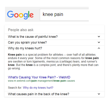
Last year, Google started updating how medical search results are displayed. For example, its Knowledge Graph panel now includes rich content on health conditions, even with downloadable PDFs. There are also “answer boxes” that show up on the first page of search results, directly pulling information from the websites. For example, you will see this “answer box” if you search for “knee pain”.

As users want to get information they’re looking for with the least amount of clicks, these updates are very helpful to them. At the same time, healthcare websites are seeing dips in their organic traffic as a result.

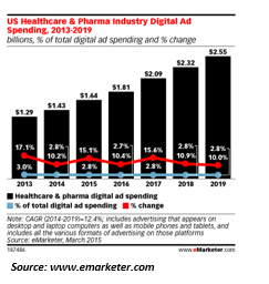
With all these challenges in mind, SEO and digital marketing in general represent a big opportunity for pharmaceutical companies. Recent eMarketer data shows that the digital ad spending keeps growing exponentially and is projected to grow.
As marketers, we understand the challenges and can customize smart SEO strategies that drive highly relevant traffic to Pharmaceutical sites.
Interested in learning more about SEO? Read more from our blog, View from the Charles:
How Does the New Google Ad Layout Impact SEO?
Google SERP News: Right Rail Ads are Gone
Want more information? Get more details on Charles River Interactive’s SEO and PPC service offerings or contact us today.
by Charles River Interactive | May 2, 2016 | Content Marketing, Industry Trends
You already know that hyperlinks and call-to-action links are an important part of the content strategy formula. But it’s not enough to simply insert as many as you can, with the hopes of scoring SEO points and potentially overwhelming people reading your content. A linking strategy should define where you place them, which words you hyperlink and which pages you link to.
Why are Hyperlinks Important?
Let’s pretend you’re not a marketing manager, but the owner of a small shop that relies on street traffic. Your first priority is getting shoppers in the door. (You could compare your window display and signage to the type of SEO work we do to attract organic traffic to your site.)
Once inside, you want them to explore past the first rack, to browse your shelves, examine items of interest and even step into a dressing room. Your ultimate goal – your call to action – is for them to make a purchase.
In this hypothetical store, the details matter: how you arrange your shelves, where top-selling merchandise goes and where you post eye-catching ‘clearance’ signs.
Web content works the same way. Strategic linking assures users don’t stop at the front door (your homepage). Instead, they click further into your site, visiting multiple pages to browse, and interacting with your content (sign up for newsletters, request an appointment, follow you on social media, etc.)
One of the key ways we can facilitate this user journey is how we utilize hyperlinks.
Hyperlink vs. Call to Action Link
There are two ways to include links in your content. Both have a place, but there are key differences:
- A hyperlink is more passive: Waltham-based Charles River Interactive is a full-service digital marketing firm.
- The call to action link – or CTA – invites the user to take action and keep reading: Waltham-based CRI is a full-service digital marketing firm. Learn more about Charles River Interactive.
Which strategy do you think would get more clicks?
With a passive hyperlink, the link to the company website is there as a ‘soft sell,’ much like the end cap in your store. If this sentence appeared in the content at a place where you definitely want interested users to visit this page, you want to use a call to action link instead.
Web Writing Best Practices for Hyperlinks
- Formatting: It may sound like common sense, but make sure your links appear with unique formatting: a different color is typical, but you may also bold or underline linked text.
- Internal vs. external links: Use links that take users away from your site as little as possible. Why send away your traffic? If it’s necessary, make sure these links open in a new tab.
- Never, ever say ‘click here’: Make it your golden rule. Yes, the goal of a call to action link is to encourage the user to take action. But think about it as being helpful, not demanding. Phrases like ‘Read more about …’ or ‘Learn more about …” let the user feel like they have more control, and as a result, they are more effective.
- Anticipate action: Web users hate surprises – especially when pages and files pop open unexpectedly. Don’t risk visitors closing out your site. Just be courteous and help them understand what happens if they click a link: ‘Download our information packet’ or ‘Watch our how-to video’ tells the user that a file will open and a video clip is about to play.
- Match pages with links: The hyperlinked text should match the page title – or H1 – of the page to which you are linking. Don’t just link random text and expect users to know where it goes; they are unlikely to take that leap of faith, and may be confused when they arrive there.
- Put a CTA on every page: Don’t get stuck with a ‘dead-end page’ that leaves users with nowhere to go. Every single page on your site should include a call to action link, and be rich with hyperlinks. This even includes your 404 redirect page. Remember: When you stop giving users something to do, they stop interacting with your site.
Interested in learning more about content development? Read more from our blog, View from the Charles:
5 Tips for Writing for Mobile
10 Tips for Effective Content Marketing on Twitter
by Charles River Interactive | April 29, 2016 | Organic Search, SEO, SEO Blogs, Uncategorized
No website is perfect. But of all the potential issues that could affect user experience, none is so obvious as the one that announces itself: the 404 error. If a user encounters this issue on your or your client’s site, the server will clearly state there is a problem, usually with some variation of “404 error: Page not found.”
If you manage a very large site, 404 errors are inevitable at some point. The key is establishing a process to find and resolve them quickly and efficiently.
What is a 404 Error?
A 404 error is a page that was not properly removed from a website or redirected in your content management system (CMS). As a result, the page appears to live on the website, but it no longer exists on your server. If a user tries to visit the page, they receive an error message.
Regularly resolving your site’s 404 errors is a signal to Google that you are maintaining a healthy website. It also improves user experience by minimizing the number of broken pages visitors may encounter.
Tips for Managing 404 Errors
- Prioritize: If you have a large site with hundreds of 404 errors, the best option is to prioritize your efforts. Use Google Analytics (or your preferred web analytics platform) to evaluate how much organic traffic each 404 page has received over a predetermined period of time. Tackle the pages with the most traffic first, and work your way down.
- Automate: You can automate redirects using the .Htaccess file in your CMS. Choose which page you want to be the replacement for a 404 error page. It may be a custom redirect page, or you may want to send users back to your homepage or to a search function. Please note: An .htaccess file is an extremely sensitive file in your CMS. We highly recommend your IT department sign-off on any edits to an .htaccess file.
3 Tools for Fixing 404 Errors
Outlined below are some tools to effectively find and resolve 404 error pages.
Google Webmaster Tools
Google Webmaster Tools (a.k.a. Search Console) is a resource from Google that web developers use to monitor website issues and control how their sites appear in search results.
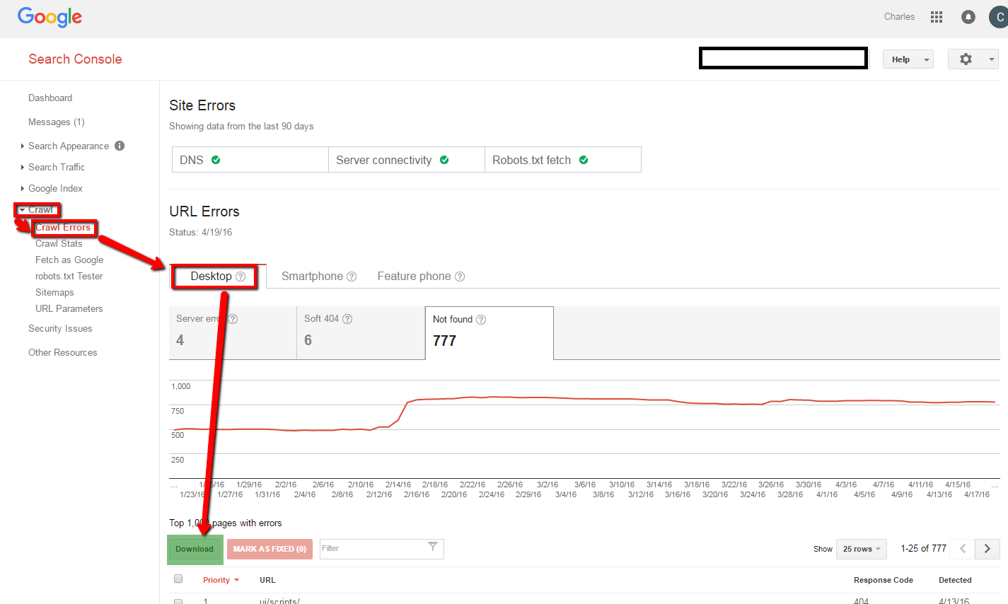
Assuming your GWT is verified, here are the steps you take:
1. Login
2. Select your domain
3. Select ‘Crawl’ on the left sidebar
4. Crawl Errors
5. Select ‘404 Errors’
6. Select ‘Download’ to export as Excel/CSV file

Screaming Frog (free and paid versions)
Screaming Frog’s SEO Spider is a tool that allows you to easily crawl hundreds of URLs for 404 errors. The free version will crawl up to 500 URLs; the paid version will crawl an unlimited number across your entire website. You just enter the URLs and the program creates a file ready for export.
Yoast SEO for WordPress (free and paid versions)
If you host your entire site or blog on WordPress, Yoast SEO (formerly known as WordPress SEO by Yoast) is a tool that can help you configure your pages for SEO. This plugin, which you download, allows you to edit your URLs, meta data, XML Sitemaps, as well as monitor for 404 errors via integration with Google Webmaster Tools. The premium version is available for $69/year for one site.
When to Use 301 Redirects
We highly recommend 301 redirects when you want to redirect individual pages or even entire websites. A 301 redirect is a permanent redirect from one URL to another. These types of redirects are especially useful when the missing page enjoyed a high organic search rank on search engines. The new, 301 redirect page maintains the SEO strength of the link even when redirected.
Sometimes there isn’t a good page to redirect to. In this case, a custom error page should be provided.
Creating Custom 404 Pages
If a permanent 301 redirect does not make sense, then you can consider creating a customized, visitor-friendly error page to appear in place of the missing URL. Typically, website use the same custom page across the site for 404 errors.
Custom error pages typically feature the following:
- A message to the user explaining that the page no longer exists
- A search box to help a visitor find exactly what they want
- A link to the home page
We hope this has been a helpful tutorial on how to find and fix 404 pages.
You can make it even easier on yourself and have Charles River Interactive give your site an in-depth SEO Analysis. Contact us today.
Interested in learning more tips for managing your website? Read more from our blog, View from the Charles:
3 Reasons to Use Google Tag Manager
Mobile Search Updates: Why You Need a Mobile Site
by Charles River Interactive | April 20, 2016 | Content Marketing, Industry Trends, Uncategorized
When is the last time you saw someone waiting – on a park or city bench, at a café table or a transit stop – and he or she wasn’t staring at a smartphone? These hand-held screens are more than a modern convenience; for many Americans, they are our connection to the world, people and services.
Nearly two-thirds – or 64 percent – of people in the U.S. own smartphones, according to the 2015 smartphone use study by the Pew Research Center. Of those, 15 percent do not have many options for getting online other than their phones.
As mobile dependency increases, marketers need to take into account mobile search, responsive design and, yes, even content strategy for a mobile audience.
Why is Writing for Mobile Important?
We use our phones to find nearby amenities, look up directions, manage banking accounts, share photos, text and call people, read news stories, follow stocks, etc.
Consider these stats from the Pew mobile study on the habits of smartphone owners in the past year:
- 68 percent followed breaking news
- 62 percent looked up info about a health condition
- 57 percent did online banking
- 44 percent looked up real estate listings
- 43 percent searched for jobs
- 30 percent wanted to take a class
- 18 percent applied for jobs
That means in the five minutes someone may spend waiting for a bus, there are endless, competing online tasks and information to fill the time. How do you make sure mobile users stay engaged with your website? A sleek, responsive design will absolutely help, but you need mobile-friendly content to round out the user experience.
5 Tips for Mobile Content
- Get to the point: As we’ve discussed, mobile users are often killing time or quickly searching for information. (And your content is competing with incoming texts and push messages). If they don’t think your site can quickly and easily answer their question or meet a need, they will move on, fast.
- Be simple and clear: Web writing best practices calls for easy-to-understand content (we aim for a 6th-grade reading level). For mobile users, it’s even more important to omit complex language and industry jargon. According to a mobile comprehension study from the University of Alberta, mobile users found it twice as hard to understand subject matter than desktop users.
- Don’t rely on your navigation: Mobile users won’t see the navigation bar that appears on your website. That means inserting strategic call-to-action links is key to facilitating the user journey. Sure, users can click on the “hamburger” icon to view page options, but keep in mind the quick, impatient, scrolling habits of the smartphone user. Deliver them helpful links, where they make sense, and it will pay off.
- Give them what they need: Mobile users are very likely to be looking for key information such as phone numbers and directions. Make these features easy to find and interact with.
- Craft super-powered H2s: These headers serve double-duty on the web: They draw in organic search traffic with keywords and phrases and organize content for rapidly skimming and scanning users. The act of thumbing down a mobile screen helps users move even more quickly through a page. Write compelling H2s to make users pause and read. But make sure they are accurate, or they may lose patience.
As a marketer, the best thing you can do is visit your own mobile site often. Many times, clients admit they have never even viewed their own content on a smartphone. Make sure you know how the experience is different from your work desktop.
Interested in learning more about mobile trends? Read more from our blog, View from the Charles:
The Rise of Mobile Chat Apps
Mobile Search Updates: Why You Need a Mobile Website

